
The Unpublished Changes to the ACT, Part II: A Follow-Up With Additional Data
Note: This blog post is Part II of a two-part series about changes to the ACT. The original post is here.
We received three main questions since publishing our original “The Unpublished Changes to the ACT” blog post in mid-July.
They were (paraphrased):
1. Why does the original blog post seem to only focus on top-scorers?
2. Does any of this even matter as long as roughly the same percent of kids are getting a given score as before?
3. Do you have any data to back up the anecdotal claims in the first blog post about test-takers from the coasts and other factors that are warping the top end of the curve?
Our answers are below.
1. Why does the original blog post seem to only focus on top-scorers?
The reason that the original blog post focused solely on the top end of the score spectrum (28+) is that, for better or for worse, Georgia’s HOPE Scholarship has created an era in which Georgia’s two flagship schools require tip-top scores to compete. UGA and Georgia Tech have average scores of 30 (top 5%) and 32 (top 2%), respectively. Thus, the original analysis is highly relevant to Georgians who see UGA and GT as increasingly amazing bargains with the HOPE scholarship and with the national reputation the schools have. Indeed, we saw not just one or two but several of our students this year turn down Ivy League schools for the Foundation Fellowship at UGA or the President’s Scholarship at GT. On the other side of the coin rests Georgia Southern, one of the schools with the most lax SAT/ACT standards in Georgia. GSU requires an ACT of 20 to apply even under their probationary admission program. That means that even the most lenient schools in the GA University System are off the table for half of test-takers. The 21-36 range is the only meaningful range to analyze for students hoping to attend a school in the GA University System or the US News Top 50 schools.
2. Does any of this even matter as long as roughly the same percent of kids are getting a given score as before?
Some who emailed us asked us whether the changes matter, given that the overall goal is to have approximately the same portion of students earn a given score or above on each test date. This is a valid question. When you’re talking about the 26-36 range, it’s not just about content; it’s about the intersection of speed and content. With more overly-diligent students taking even more practice tests before taking the real exam, the ACT’s response has been to slowly raise the intellectual tenor of the exam since 2011 to stratify tip-top scorers from each other, especially in Math and Science. Ethically, this isn’t necessarily a bad thing; making the test intellectually harder but then providing a more generous curve minimizes the damage caused by a careless error. However, the new test is not just harder in the “Einstein e=mc^2” sense; it’s harder in the “my brain cannot process this material in such a short amount of time” sense. The intellectual content has gotten more rigorous, while the timing for each section has stayed exactly the same; thus, it’s tougher to finish in time. Top-scoring students need to know this speed differential going in; they are done a disservice by relying solely on tee-ball ACT Red Book tests and then being thrown into the fast-pitch cage on test day.
The proof of this increase in speed and intellectual tenor is in the scoring scale. ACT Red Book Test #1 Science section has not one, not two, not three, but four “evil bars” (2 point gaps for one missed question), such that a minus 4 drops a student seven whole points to a 29. By contrast, a minus four on what many consider the intellectually hardest Science test ever administered, December 2013, was still a 35–as it should have been. Depending on whether a student’s main issue is speed vs. content, allocating time as he or she was used to from the Red Book tests could have resulted in a very different score. Finally, it seems from the 2013-2014 tests that closer to 2-4 questions per test require outside Science knowledge, compared to 0-2 on older tests. Again, something not relevant for middle-scorers, but highly relevant in the upper ranges. The Red Book Test #1 Science example was not cherry-picked, either. The Science section on most other available practice tests (0661C, 0359F, and others) also has three “evil bars.”
3. Do you have any data to back up the anecdotal claims in the first blog post about test-takers from the coasts and other factors that are warping the top end of the curve?
In addition to the Washington Post article from the first post and our own anecdotes, we’ve downloaded data from the ACT’s own score statistics site to prove the point. In a moment, we’ll look at some data from the entire USA, Georgia, and some of the higher- and lower-achieving states.
All states are not created equal. We analyzed data from 2010, 2012, and 2013 for the USA, Georgia, and a smattering of high- and low-achieving states. We saw some pretty incredible trends emerge, the most important of which were:
A) High-achievers from the highest-achieving states (read: the Northeast and California) are now taking the test in disproportionately higher numbers. While the overall participation rate in the ACT may not have changed dramatically in the Northeastern states (the same ones that have historically had the highest National Merit cutoff scores in the nation), it is typically the top-scoring test-takers that seek to travel furthest away from home for college and/or apply to top-notch schools, as articles from blogs like The College Solution have covered extensively. Whether the ACT has been growing as a whole in those states is unimportant; what is important is whether a stampede of top-scorers in those states is impacting the top end of the curve. Even if the national percentage of students achieving a given score is staying roughly flat over the years, an influx of top-scorers who formerly would have been purely SAT students can make it—relatively speaking—harder to achieve the same score before said stampede. Students have both tests as options.
B) Data from extended time test-takers was finally included in the aggregate statistics for the first time in 2013.
It’s interesting that while ACT extended time students make up only 4% of the overall test-takers, in the first year that those students’ data began being included with the standard time test-takers, the number of overall nationwide perfect 36’s went up by 48% in a single year. Are 36’s overrepresented by 1,200% in that cohort? Unfortunately, the ACT only publishes the average score data (21.0 average for regular time, 17.5 for extended time). (Page 8, Table 1.7). Thus, those two average numbers aren’t any more helpful than saying the average temperature for Atlanta for all 365 days is 64 degrees.
Three examples of the 2012-2013 shift:
1) In Connecticut, the number of test-takers rose by 359 test-takers, but the number of 30+ scores (top 5% scores) rose by 284. So 80% of Connecticut’s net new test-takers would appear to have accrued to the top 5%.
2) In Maryland, only 3.6% more students took it in 2013 than 2012, yet the perfect 36’s exploded by 183%.
3) In New York, only 1.0% more students took it in 2013 than 2012, while 33+’s increased 15 times as fast and the perfect 36’s jumped by 117% once extended time data was included.
For those high-flying states, we think the dramatic change from 2012-2013 is a perfect storm of two factors: more of the top-tier students studying/taking the ACT in those states and ultra-savvy parents who have perfected the art form of applying for extended time accommodations in much the same way as they navigate the elite pre-school application process.
C) Additional Three-Year Data Analysis (2010 data vs. 2013 data):
Growth in Northeast Dominance:
– New York’s ACT test-takers only grew 6% from 2010 to 2013, but their 33+’s grew by 30% (500% as much) and their perfect 36’s grew by 174% (2,800% as much).
– New Jersey’s ACT test-takers only grew by 26% from 2010 to 2013, but their 33+’s grew by 59% and their perfect 36’s grew by a whopping 386%.
– A student from New Jersey was literally 16 times as likely to get a 36 as a student from West Virginia and over 5 times as likely to get a 36 as a student from Mississippi. This data wasn’t cherry-picked either; had we used the admittedly-small District of Columbia instead, those two numbers would have been 27 times as likely and 9.5 times as likely, respectively.
– Some people might point to the fact that this data could be skewed by the fact that some states (like Mississippi) require all students to take the ACT. If anything, it proves the opposite; even though every student in the entire state of Mississippi takes it and only 1/4 of the kids in New Jersey take it, New Jersey still has far more top scorers with 13% fewer test takers.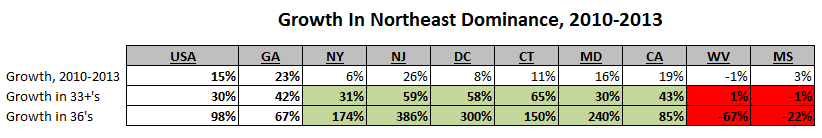
4. So now what?
Students should use the official ACT Red Book for their initial practice tests as they build their foundation, with the knowledge that they are intellectually easier / more vigorously scaled. Then, they should use newer tests for their additional practice. As far as practice goes, four tests are available via www.badtesttakers.com/resources/, and many high school guidance offices have pre-printed ACT packets of the 1267C test on hand. Parents could also ask their guidance offices to order the two newer, fresher tests that are available to high schools. A few proactive guidance offices like Harrison HS in Kennesaw have begun keeping these tests on hand and giving them to students at cost; it’s a fantastic idea.
Since many diligent students are not used to potentially not finishing an exam, with these speed changes, more than ever, it’s important for students to remember that attitude matters just as much as aptitude. Focus on increasing your speed, getting ones that you’re already getting correct more quickly, and allocating your time wisely.
Feel free to email us with questions at [email protected]!
Note: The numerous sources that went into this article are listed below.
Sources:
ACT test-taker data: 2013 Reports (National and State): http://www.act.org/newsroom/data/2013/profilereports.html and http://www.act.org/newsroom/data/2013/states.html
2012 Reports (National and State): http://www.act.org/newsroom/data/2012/states.html
2010 Data: http://www.act.org/newsroom/data/2010/states.html
2010 National PDF: http://www.act.org/newsroom/data/2010/pdf/profile/National2010.pdf
2011 National PDF: http://www.act.org/newsroom/data/2011/pdf/profile/National2011.pdf
2012 National PDF: http://www.act.org/newsroom/data/2012/pdf/profile/National2012.pdf
2013 National PDF: http://www.act.org/newsroom/data/2013/pdf/profile/National2013.pdf
PSAT Cutoffs by State: http://www.collegeplanningsimplified.com/NationalMerit.html
Mother Lode of Data: http://www.act.org/newsroom/data/